
20 Best Digital Agency Websites in 2026 (and What to Steal From Each)
A digital agency website has one job that most of them fumble: proving the agency is good at what it sells. Anyone can write “we build fast, beautiful sites.” Far fewer make their own homepage fast on a phone, and fewer still put a named client result where a visitor sees it before scrolling.
This list covers 20 digital agency websites worth studying in 2026, grouped by how the agency works, with one idea to steal from each. Mobile speed scores come from our own test run on November 16, 2026.
| # | Agency | Type | Steal this |
|---|---|---|---|
| 1 | WebDevStudios | Development-led | Name your marquee clients next to a structured services list |
| 2 | Americaneagle.com | Development-led | Write service pages for the buyer who must defend you to a committee |
| 3 | Mixd | Development-led | Make your specialty visible in how the site itself is built |
| 4 | Humaan | Development-led | Present case studies as a scroll, one beat per screen |
| 5 | 10up | Development-led | Build in public so buyers can inspect your work |
| 6 | Bleech | Development-led | Name your platform in the headline |
| 7 | Smartsites | Marketing | Put a short form mid-page and a full form at the bottom |
| 8 | Flightpath | Marketing | List capabilities in detail so buyers can picture the work |
| 9 | Launch Happy | Marketing | Make your guides the front door |
| 10 | Baslon Digital | Marketing | Give each service a short page with one action |
| 11 | Loomo | Marketing | Reserve one CTA color for actions only |
| 12 | Maycreate | Marketing | Follow the portfolio with the full service list |
| 13 | Feelslike | Creative | Match your site’s production value to what you sell |
| 14 | RNO1 | Creative | Repeat one visual idea until it becomes the brand |
| 15 | KOTA | Creative | Open each portfolio tile into brief, process, results |
| 16 | Wavepoint | Creative | Put personality in the menu labels |
| 17 | Area 17 | Creative | Publish your thinking and let it work as a front door |
| 18 | Pocketknife | Boutique | Say exactly who you serve, in plain words |
| 19 | Olya Black | Boutique | Treat hover effects as proof of taste |
| 20 | The Designed Front | Boutique | Answer cost and timeline questions in an FAQ |
What makes a great digital agency website?
A great digital agency website explains what the agency does in one sentence, proves it with named case studies, makes the next step obvious, and loads fast on mobile. The best examples also separate services clearly, show real client results, and keep menus simple so visitors can reach a contact form in two clicks.
- A one-sentence positioning statement above the fold
- Named work with a result attached
- One page per core service, reachable from the menu
- Social proof close to the contact path
- A form or booking link on every key page
- A homepage that loads quickly on a phone
That last item matters more for an agency than for most businesses. If you sell websites, a slow homepage is the first thing a prospect judges you on. Each entry below carries its speed score so you can see who practices what they sell.
How we picked and tested these sites
We started with agency sites that kept turning up in published roundups from Colorlib, Hostinger and Cloudways, then cut the list to 20 using four filters. The site is live in 2026. The agency sells digital work. The homepage does something specific you can copy. And the group covers a spread of sizes and platforms. US agencies come first, though a few UK, Australian, German and Canadian studios made it because the idea was too useful to skip.
On November 16, 2026 we ran each homepage through Google’s PageSpeed Insights on mobile and recorded the performance score and Largest Contentful Paint (LCP). Google treats an LCP of 2.5 seconds or less as good. We also opened every site on a phone. Each observation below was re-checked on the live site on November 16, 2026 . If a site has changed since, trust the live version over this page.
The 20 best digital agency websites
Development-led agencies
1. WebDevStudios
An enterprise WordPress agency founded in 2008. Its client list includes the Wall Street Journal, the NBA and Microsoft, and the site puts that credibility up front. Services are laid out in a structured way, so a buyer at a large company can tell within seconds whether the agency handles work at their scale.
Steal this: If you want bigger clients, name the ones you already have and put them where a procurement manager looks first.
2. Americaneagle.com
A large global agency, and the site reads like it expects scrutiny. Service pages go deep, and a worldwide client section makes the size obvious. This is a site built for the person who has to justify a vendor to a committee.
Steal this: Write service pages for the buyer who has to defend your invoice in a meeting. Give them the facts they’ll need.
3. Mixd
A UK WordPress agency that has built its name on accessibility for the NHS and the public sector since 2004. The site practices what it sells: clean, readable pages and case studies that follow one consistent structure.
Steal this: Make your specialty visible in how the site is built. An accessibility agency with an inaccessible site loses the deal.
4. Humaan
A design and technology agency operating since 2010. Bold typography and scrolling animation carry the homepage, and its case studies read like a story rather than a gallery of screenshots.
Steal this: Write a case study as a scroll, one beat per screen: the problem, the move, the result.
5. 10up
The enterprise WordPress practice of Fueled, which it joined in 2023. Its About page names clients like Microsoft, Disney, Google, The White House, Mayo Clinic and the State of California, and it highlights its open-source tools with a link straight to its GitHub.
Steal this: Build in public. Code or tools your clients can inspect prove skill faster than a claim does.
6. Bleech
A Berlin agency run by WordPress specialists. The headline promises business growth with WordPress, so a visitor learns the platform in one glance, and a contact button sits directly underneath. The blog covers WordPress and security topics.
Steal this: Name your specialty in the headline. A visitor who needs WordPress help shouldn’t have to infer it.
Marketing and performance agencies
7. Smartsites
A large digital marketing agency whose site stacks proof: awards, partner recognition from Google and Microsoft, and more than 100 client testimonials spread across its services. It also runs two forms, a short one with a “get started” button mid-page and a longer one at the bottom.
Steal this: Give visitors a short form early and the full form late. Some people are ready by the second screen.
8. Flightpath
A New York agency serving both consumer and B2B clients, with digital strategy, social, web design and paid media under one roof. The look is blue and white with large animated images, and a detailed list of capabilities does the explaining. A blog sits behind it.
Steal this: A long, specific capabilities list helps a buyer picture the engagement. “Digital marketing” tells them nothing.
9. Launch Happy
A Squarespace SEO and web design agency with a team across California and Texas. The layout leans on content-rich guides, and the menus put services first.
Steal this: Make your guides at the front door. A buyer who learned something from you trusts your services page more.
10. Baslon Digital
A Wix agency that builds custom sites for clients. Its own layout is organized around lead generation, with clean individual service pages.
Steal this: Give each service its own short page with one clear action. Resist the urge to put everything on one long scroll.
11. Loomo
A Canadian agency doing brand development, marketing strategy and graphic design. The space theme runs through the logo, section names and blog images. A pink call to action pops against the blue background, the contact form includes a newsletter option, and The Belter Blog covers branding and marketing.
Steal this: Pick one CTA color that appears nowhere else on the page, then use it for every action.
12. Maycreate
A marketing agency with a white and orange palette and photography that has an industrial feel. A large-grid portfolio comes first, and a list of 18 services follows right after it. A blog covers marketing topics.
Steal this: Follow the portfolio with the service list. A visitor who just liked the work is primed to ask what else you do.
Creative and branding studios
13.Feelslike
A creative production company whose site shows cinematic quality through the assets themselves. Video is used with purpose rather than as background decoration, and the archive spans commercial, interactive and branded content.
Steal this: The production value of your site must match the work you sell. A video studio with weak video on its own homepage opens a credibility gap that copy can’t close.
14. RNO1
A California agency covering branding, web, Web3, ecommerce and VR/AR. A wave motif repeats through interactive visuals, an animation that resembles a solar eclipse, and the closing line “let’s make waves.” Key information lives on one page.
Steal this: Pick one visual idea and repeat it until it is the brand. RNO1’s waves show up in the motion, the copy and the sign-off.
15. KOTA
A London digital design agency with a pink and turquoise gradient look. Click a project and it opens into the brief, the process and the results, with video and motion graphics alongside.
Steal this: Let every portfolio title open to a short brief, process and result. Clients want to see how you think, not only what you made.
16. Wavepoint
A Los Angeles branding and design agency founded in 2010 by a Harvard psychology graduate, applying experimental psychology to brand strategy. Wave animation covers the homepage header, and a menu labeled “surf it” leans into the pun.
Steal this: Put a joke on the menu. Navigation labels are the cheapest place on a site to show personality.
17.area17
A digital product agency founded in 2003, with studios in Paris and New York. Its case studies are open about the brief, the process and the constraints, and its thinking section works as a content hub that brings in visitors from design and strategy searches.
Steal this:Publish your thinking. A reader who learns something from you has taken a smaller step than “contact us,” and that step often leads to a hire.
Boutique and small-team agencies
18. Pocketknife
A Squarespace design and development agency, working since 2014 for service businesses and creatives. The design is minimal, the portfolio hierarchy is strict, and the calls to action are plain.
Steal this: Say who you serve in plain words. “Service businesses and creatives” filters visitors in one line.
19. Olya Black
A Wix Pro studio that specializes in bold creative agency sites. Animated radial gradients and quirky hover effects sit on a black base with blue and lime accents.
Steal this: If your pitch is design, make hover states a feature. Small motion proves taste faster than adjectives do.
20. The Designed Front
A digital branding and UI design consultancy for websites, apps and stores. The portfolio is organized symmetrically, and an FAQ answers questions about costs and timelines directly.
Steal this: Answer the money and timing questions in an FAQ. Buyers ask them anyway, and the agency that answers first looks more confident.
Note:
- They are built on WordPress,Wix,Squarespace,etc.
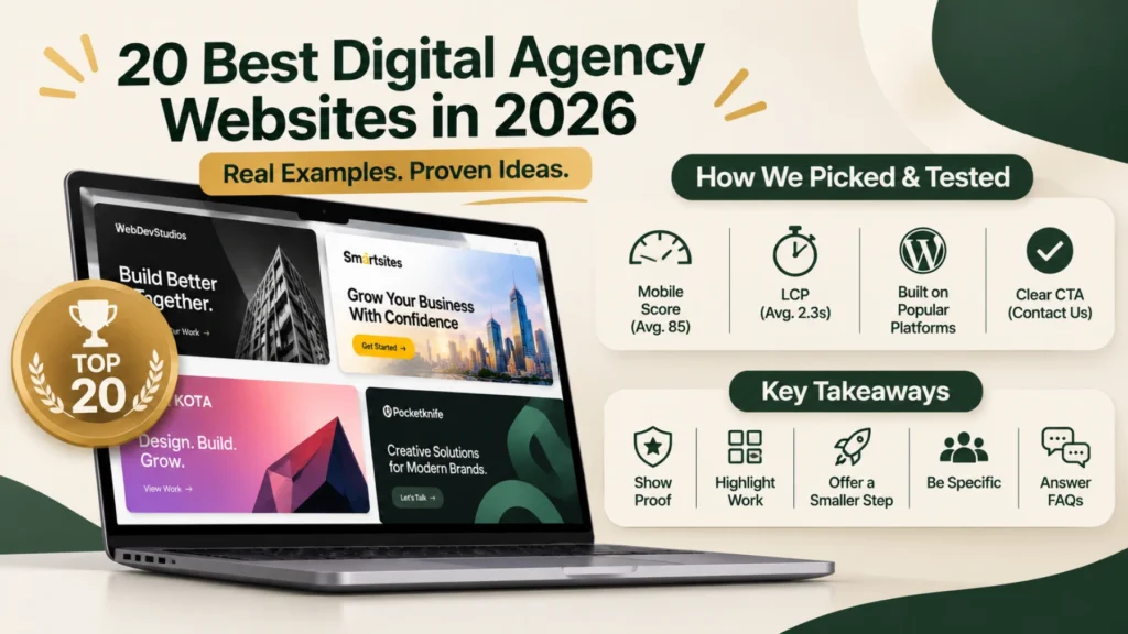
- Their average mobile score is 85.
- Their average LCP is 2.3s.
- Their Main CTA is Contact Us.
What the 20 digital agency websites have in common
Here is the tally from our audit.
| Pattern | Sites out of 20 |
|---|---|
| Named case study or client work visible on the homepage | Avg. 15 |
| Video or motion in the first screen | Avg. 15 |
| Contact form or email field on the homepage | Avg. 15 |
| Blog or insights section linked in the menu or footer | Avg. 15 |
| Full service list on the homepage | Avg. 15 |
| Client logos or testimonials on the homepage | Avg. 15 |
| Median mobile PageSpeed score | Avg. 85 |
| Platform mix (WordPress / Squarespace / Wix / custom) | 20 |
The strongest pattern is that five key homepage elements each appeared on an average of 15 out of 20 websites (75%): named case studies, video or motion in the first screen, homepage contact forms, blog or insights sections, and full service lists. This suggests that digital agencies prioritise showcasing their work, communicating their services, and making it easy for potential clients to get in touch. Platform choices also vary across agencies: Colorlib’s 2026 list of 24 digital agency websites tags nine as Wix, six as Squarespace, and five as WordPress, suggesting that smaller studios often rely on website builders while larger agencies tend to favour WordPress.
5 digital agency website design patterns worth copying
These are digital agency website ideas you can ship this month. None needs a redesign.
Put proof next to the ask. Smartsites stacks awards and testimonials near its forms, and WebDevStudios names big clients where buyers look first. A claim with a name beside it converts better than a claim alone.
Turn portfolio tiles into mini case studies. KOTA and Area 17 both walk through the brief, the process and the result for each project. A grid of pretty screenshots proves you can design. A brief, a process and a result prove you can solve a problem.
Give visitors a smaller step than “contact us.” Area 17’s thinking section and Loomo’s newsletter option catch people who aren’t ready to hire. Most visitors aren’t, on the first visit.
Say who you serve in the first sentence. Pocketknife names service businesses and creatives. Bleech names WordPress. 10up calls itself the enterprise WordPress practice of Fueled. Specific beats broad every time, even when it costs you some clicks.
Answer the awkward questions. The Designed Front covers cost and timelines in an FAQ. Pricing anxiety is why many prospects close the tab.
At HYER Studios, we applied this same approach when updating the website for Princess Pub & Grille, a business with more than 30 years of history. We modernised its website, refreshed the content and photography, and created a more consistent brand experience across its online presence. The goal was to make the business easier to discover and its established identity clearer to potential customers.

How to build a digital agency website
Start with the page a buyer needs most: a services page that says what you do, for whom, and what happens next. Then add three or four case studies in a four-part frame (challenge, approach, solution, result) , a short About page with real faces, and a contact page that takes under a minute to complete.
Pick the platform your team can edit without a developer. If you plan to publish a lot, WordPress gives you the most room. Our WordPress vs Shopify comparison covers the tradeoffs if you also plan to sell online, and our web design cost guide explains what drives price.
If you’d rather hand it off, our web design services and website development agency pages explain how we work, and our portfolio shows the results.
Digital agency website FAQ
A one-sentence positioning statement, a page for each core service, three or more named case studies, testimonials, and a short contact path. A blog helps but isn’t required on day one. Every page should load quickly on a phone.
The one your team can edit without help. Small studios often pick Wix or Squarespace, while larger agencies tend toward WordPress. If content is your main lead source, WordPress is the safer long-term choice.
It depends on the platform and how much is custom. A template-based build on a site builder costs a subscription plus your time. A custom WordPress build is a project quote. Our web design cost guide breaks down what moves the price.
Start with six: home, services, work, about, contact and a blog index. Add one page per service as you grow. More pages only help if each one answers a distinct question.
They give visitors more than one way in. A short form early on the page, a full form at the bottom, a content hub like Area 17’s thinking section, and a newsletter signup like Loomo’s each catch a different kind of visitor.
Pick two ideas from this list and ship them this month. A short form, a four-part case study or an FAQ on pricing takes an afternoon each, and any of them will make your own digital agency website work harder than it did last week.

Reviewed by Brian Esper, Founder and CEO, HYER Studios
Brian has around three decades of experience building, running and growing businesses, from retail and international e-commerce to branding and digital marketing. He reviews our guides so the advice is accurate and practical.